はじめに
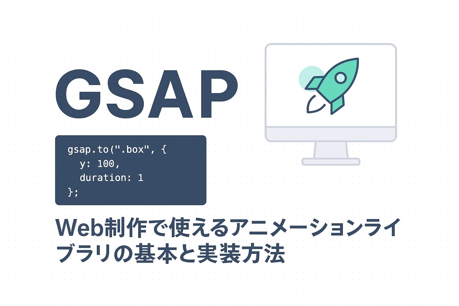
今回は、現場で愛用されているGSAPを使って、コピペするだけで実装できる実用的なアニメーションを8つご紹介します。
基本的なフェードインから高度なアニメーションまで、段階的にスキルアップできる構成で解説してますので、ぜひ参考にしてみてください。
必要な前提知識
- HTML/CSSの基礎
- JavaScriptの基本(変数、関数程度でOK)
- jQueryが読める程度でOK
- GSAPの基礎
GSAPの基本的な使い方は、以下の記事で解説していますので、あわせてご確認ください。
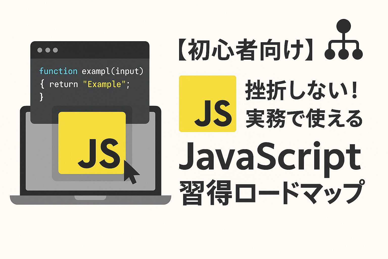
JavaScriptは以下の記事で学習方法について解説していますので、こちらもあわせてご確認ください。
1. フェードイン+Y移動
汎用中の汎用。見出しや画像を自然に表示させる基本パターン。
See the Pen 1. フェードイン+Y移動 by ryoma (@hwjgdjpk-the-decoder) on CodePen.
HTML
<div class="fade-container">
  <h2 class="fade-title">サービスの特徴</h2>
  <p class="fade-text">お客様のビジネスを成功に導く3つの理由</p>
  <div class="fade-cards">
    <div class="fade-card">高品質</div>
    <div class="fade-card">低価格</div>
    <div class="fade-card">短納期</div>
  </div>
</div>
CSS
.fade-container {
  max-width: 1000px;
  margin: 80px auto;
  padding: 40px;
  text-align: center;
}

.fade-title {
  font-size: 2.5rem;
  margin-bottom: 20px;
  color: #333;
  font-weight: bold;
}

.fade-text {
  font-size: 1.2rem;
  color: #666;
  margin-bottom: 40px;
}

.fade-cards {
  display: flex;
  gap: 30px;
  justify-content: center;
  flex-wrap: wrap;
}

.fade-card {
  width: 250px;
  padding: 40px;
  background: white;
  border-radius: 10px;
  box-shadow: 0 10px 30px rgba(0,0,0,0.1);
  font-weight: bold;
  font-size: 1.2rem;
}
JavaScript
gsap.from(".fade-title", {
  duration: 1,
  y: 50,  // 下から50px上に移動
  opacity: 0,
  ease: "power2.out"
});

gsap.from(".fade-text", {
  duration: 1,
  y: 30,
  opacity: 0,
  delay: 0.2  // 0.2秒遅らせる
});

gsap.from(".fade-card", {
  duration: 1,
  y: 50,
  opacity: 0,
  stagger: 0.2,  // 0.2秒ずつずらして表示
  delay: 0.4
});
2. メニュー開閉
モバイルやSPメニューでの実用率が高い円形展開パターン。
See the Pen 2. メニュー開閉(clip-path円形リビール) by ryoma (@hwjgdjpk-the-decoder) on CodePen.
HTML
<div class="menu-container">
  <button class="menu-trigger">
    <span></span>
    <span></span>
    <span></span>
  </button>

  <nav class="circle-menu">
    <ul>
      <li><a href="#home">ホーム</a></li>
      <li><a href="#about">私たちについて</a></li>
      <li><a href="#service">サービス</a></li>
      <li><a href="#contact">お問い合わせ</a></li>
    </ul>
  </nav>
</div>
CSS
.menu-container {
  position: fixed;
  top: 20px;
  right: 20px;
  z-index: 1000;
}

.menu-trigger {
  position: relative;
  width: 60px;
  height: 60px;
  background: #333;
  border: none;
  border-radius: 50%;
  cursor: pointer;
  z-index: 1002;
}

.menu-trigger span {
  position: absolute;
  left: 50%;
  width: 25px;
  height: 2px;
  background: #fff;
  transform: translateX(-50%);
  transform-origin: center;
  transition: top .3s ease, transform .3s ease, opacity .2s ease;
}

.menu-trigger span:nth-child(1) { top: calc(50% - 8px); }
.menu-trigger span:nth-child(2) { top: 50%; }
.menu-trigger span:nth-child(3) { top: calc(50% + 8px); }

.menu-trigger.active span:nth-child(1) {
  top: 50%;
  transform: translateX(-50%) rotate(45deg);
}
.menu-trigger.active span:nth-child(2) {
  opacity: 0;
}
.menu-trigger.active span:nth-child(3) {
  top: 50%;
  transform: translateX(-50%) rotate(-45deg);
}

.circle-menu {
  position: fixed;
  top: 0;
  right: 0;
  width: 100vw;
  height: 100vh;
  background: #333;
  clip-path: circle(0px at calc(100% - 50px) 50px);
  z-index: 1001;
  pointer-events: none;
}

.circle-menu.active {
  pointer-events: auto;
}

.circle-menu ul {
  list-style: none;
  padding: 0;
  margin: 0;
  height: 100%;
  display: flex;
  flex-direction: column;
  justify-content: center;
  align-items: center;
  gap: 30px;
}

.circle-menu a {
  color: white;
  text-decoration: none;
  font-size: 2rem;
  font-weight: bold;
  opacity: 0;
  transform: translateY(20px);
}
JavaScript
// メニュー開閉の制御
const trigger = document.querySelector('.menu-trigger');
const menu = document.querySelector('.circle-menu');
const menuItems = document.querySelectorAll('.circle-menu a');
let isOpen = false;

trigger.addEventListener('click', () => {
  isOpen = !isOpen;

  if (isOpen) {
    trigger.classList.add('active');
    menu.classList.add('active');

    // clip-pathアニメーション(必ず0から始める)
    gsap.fromTo(menu,
      { clipPath: "circle(0px at calc(100% - 50px) 50px)" },
      { duration: 0.6, clipPath: "circle(150% at calc(100% - 50px) 50px)", ease: "power2.inOut" }
    );

    // メニュー項目をフェードイン
    gsap.to(menuItems, {
      duration: 0.5,
      opacity: 1,
      y: 0,
      stagger: 0.1,
      delay: 0.3
    });

  } else {
    trigger.classList.remove('active');

    // メニュー項目をフェードアウト
    gsap.to(menuItems, {
      duration: 0.3,
      opacity: 0,
      y: 20
    });

    // clip-pathアニメーション
    gsap.to(menu, {
      duration: 0.6,
      clipPath: "circle(0px at calc(100% - 50px) 50px)",
      ease: "power2.inOut",
      delay: 0.2,
      onComplete: () => {
        menu.classList.remove('active');
      }
    });
  }
});
3. テキストリビール(1文字ずつ)
タイピング風ではなく、可読性を維持した「文字落下/スライドイン」型。
See the Pen Untitled by ryoma (@hwjgdjpk-the-decoder) on CodePen.
HTML
<div class="text-reveal-container">
  <h1 class="reveal-title">Web Design Studio</h1>
  <p class="reveal-subtitle">想いをカタチに、未来をデザインする</p>
</div>
CSS
.text-reveal-container {
  min-height: 100vh;
  display: flex;
  flex-direction: column;
  justify-content: center;
  align-items: center;
  background: #1a1a1a;
  color: white;
}

.reveal-title {
  font-size: clamp(2rem, 8vw, 5rem);
  font-weight: 700;
  margin-bottom: 20px;
  overflow: hidden;
}

.reveal-subtitle {
  font-size: clamp(1rem, 3vw, 1.5rem);
  opacity: 0.9;
  overflow: hidden;
}

.char {
  display: inline-block;
}
JavaScript
// テキストを1文字ずつ分割
function splitText(element) {
  const text = element.textContent;
  element.innerHTML = '';

  // 文字を1つずつspanで囲む
  text.split('').forEach(char => {
    const span = document.createElement('span');
    span.className = 'char';
    // スペースの処理
    span.textContent = char === ' ' ? '\u00A0' : char;
    element.appendChild(span);
  });
}

// タイトルのアニメーション
const title = document.querySelector('.reveal-title');
splitText(title);

gsap.from('.reveal-title .char', {
  duration: 0.8,
  y: 100,
  opacity: 0,
  stagger: 0.03,  // 0.03秒ずつずらす
  ease: "power4.out"
});

// サブタイトルのアニメーション
const subtitle = document.querySelector('.reveal-subtitle');
splitText(subtitle);

gsap.from('.reveal-subtitle .char', {
  duration: 0.6,
  y: 100,
  opacity: 0,
  stagger: 0.02,
  ease: "power3.out",
  delay: 0.5
});
4. スクロール進捗バー
記事やブログに実装するとUXが向上する定番UI。
See the Pen 4. スクロール進捗バー by ryoma (@hwjgdjpk-the-decoder) on CodePen.
HTML
<svg class="progress-svg" viewBox="0 0 100 4" preserveAspectRatio="none">
  <line class="track" x1="0" y1="2" x2="100" y2="2" />
  <line class="progress" x1="0" y1="2" x2="100" y2="2" />
</svg>

<article class="content">
  <h1>長い記事のタイトル</h1>
  <p>コンテンツが入ります</p>
  <p>下にスクロールしてください</p>
  <div id="filler"></div>
</article>
CSS
.progress-svg {
  position: fixed;
  top: 0;
  left: 0;
  width: 100%;
  height: 6px;
  z-index: 9999;
}

.track {
  stroke: #2a2f4a;
  stroke-width: 6;
}

.progress {
  stroke: #667eea;
  stroke-width: 6;
  stroke-linecap: round;
}

.content {
  max-width: 800px;
  margin: 80px auto;
  padding: 40px;
  line-height: 1.8;
}

#filler {
  height: 4000px; /* スクロール量を確保 */
}
JavaScript
window.addEventListener("DOMContentLoaded", () => {
  gsap.registerPlugin(ScrollTrigger);

  const line = document.querySelector(".progress");
  const len = line.getTotalLength();

  gsap.set(line, { strokeDasharray: `${len} ${len}`, strokeDashoffset: len });

  gsap.to(line, {
    strokeDashoffset: 0,
    ease: "none",
    scrollTrigger: {
      start: 0,
      end: "max",
      scrub: true
    }
  });
});
5. 横スクロール(pin固定セクション)
実績紹介や年表表示に有効な横スクロール演出。
※↓スクロールしてみてください!
See the Pen 5. 横スクロール(pin固定セクション) by ryoma (@hwjgdjpk-the-decoder) on CodePen.
HTML
<section class="horizontal-scroll">
  <div class="pin-wrap">
    <div class="horizontal-content">
      <div class="panel">
        <h2>2020年</h2>
        <p>創業・サービス開始</p>
      </div>
      <div class="panel">
        <h2>2021年</h2>
        <p>事業拡大・新サービス</p>
      </div>
      <div class="panel">
        <h2>2022年</h2>
        <p>海外展開スタート</p>
      </div>
      <div class="panel">
        <h2>2023年</h2>
        <p>業界No.1達成</p>
      </div>
    </div>
  </div>
</section>
CSS
.horizontal-scroll {
  height: 100vh;
  overflow: hidden;
  background: #f6f7fb;
}
.pin-wrap {
  height: 100vh;
  display: flex;
  align-items: center;
}
.horizontal-content {
  display: flex;
  gap: 50px;
  padding: 0 50px;
}
.panel {
  min-width: 80vw;
  max-width: 900px;
  height: 60vh;
  background: #fff;
  border-radius: 20px;
  padding: 60px;
  box-shadow: 0 20px 60px rgba(0, 0, 0, 0.1);
  display: flex;
  flex-direction: column;
  justify-content: center;
}
.panel h2 {
  font-size: clamp(2rem, 6vw, 3.2rem);
  margin: 0 0 16px;
  color: #667eea;
}
.panel p {
  font-size: clamp(1rem, 2vw, 1.2rem);
  color: #666;
  margin: 0;
}
@media (max-width: 640px) {
  .panel {
    min-width: 90vw;
    height: 65vh;
    padding: 40px;
  }
}
JavaScript
window.addEventListener("DOMContentLoaded", () => {
  gsap.registerPlugin(ScrollTrigger);

  const container = document.querySelector(".horizontal-scroll");
  const content = document.querySelector(".horizontal-content");
  const panels = gsap.utils.toArray(".panel");

  const getScrollAmount = () => Math.max(0, content.scrollWidth - window.innerWidth);

  const scrollTween = gsap.to(content, {
    x: () => -getScrollAmount(),
    ease: "none",
    scrollTrigger: {
      trigger: container,
      start: "top top",
      end: () => "+=" + getScrollAmount(),
      scrub: true,
      pin: true,
      anticipatePin: 1,
      invalidateOnRefresh: true
    }
  });

  panels.forEach((panel) => {
    gsap.from(panel, {
      opacity: 0,
      scale: 0.92,
      duration: 0.5,
      scrollTrigger: {
        trigger: panel,
        containerAnimation: scrollTween,
        start: "left center",
        toggleActions: "play none none reverse"
      }
    });
  });

  ScrollTrigger.addEventListener("refreshInit", () => {
    gsap.set(content, { x: 0 });
  });
  window.addEventListener("resize", () => ScrollTrigger.refresh());
});
6. 数値カウントアップ
実績やKPIを訴求するページでよく使われる演出。
See the Pen Untitled by ryoma (@hwjgdjpk-the-decoder) on CodePen.
HTML
<section class="counter-section">
  <div class="counter-item">
    <span class="counter" data-target="1234">0</span>
    <p>お客様数</p>
  </div>
  <div class="counter-item">
    <span class="counter" data-target="98">0</span><span>%</span>
    <p>満足度</p>
  </div>
  <div class="counter-item">
    <span class="counter" data-target="567">0</span>
    <p>プロジェクト数</p>
  </div>
</section>
CSS
.counter-section {
  display: flex;
  justify-content: center;
  gap: 80px;
  padding: 100px 40px;
  background: #f8f9fa;
  flex-wrap: wrap;
}
.counter-item {
  text-align: center;
}
.counter {
  font-size: 4rem;
  font-weight: 700;
  color: #667eea;
  display: inline-block;
  line-height: 1;
}
.counter-item p {
  margin-top: 10px;
  font-size: 1.2rem;
  color: #666;
}
JavaScript
window.addEventListener("DOMContentLoaded", () => {
  gsap.registerPlugin(ScrollTrigger);

  document.querySelectorAll(".counter").forEach((el) => {
    const end = Number(el.dataset.target) || 0;
    const obj = { v: 0 };

    gsap.to(obj, {
      v: end,
      duration: 1.8,
      ease: "power1.out",
      scrollTrigger: { trigger: el, start: "top 85%", once: true },
      onUpdate: () => { el.textContent = Math.round(obj.v).toLocaleString("ja-JP"); }
    });
  });
});
7. マスクリビール(画像/見出し強調)
clip-pathやoverflow:hiddenでコンテンツを切り出す実用演出。
See the Pen 7. マスクリビール(画像/見出し強調) by ryoma (@hwjgdjpk-the-decoder) on CodePen.
HTML
<div class="mask-reveal-container">
  <div class="reveal-text">
    <h2>Creative Design</h2>
    <p>革新的なデザインで、ビジネスを次のステージへ</p>
  </div>
  <div class="reveal-image">
    <img src="https://picsum.photos/id/1015/1200/800" alt="Dummy Image" />
    <div class="image-overlay"></div>
  </div>
</div>
CSS
.mask-reveal-container {
  max-width: 800px;
  margin: 100px auto;
  padding: 40px;
}
.reveal-image {
  position: relative;
  overflow: hidden;
  border-radius: 20px;
  margin-bottom: 40px;
}
.reveal-image img {
  width: 100%;
  height: auto;
  display: block;
}
.image-overlay {
  position: absolute;
  inset: 0;
  background: #667eea;
  transform-origin: left;
  transform: scaleX(1);
}
.reveal-text {
  overflow: hidden;
}
.reveal-text h2 {
  font-size: 3rem;
  margin: 0 0 20px;
  transform: translateY(100%);
}
.reveal-text p {
  font-size: 1.2rem;
  color: #666;
  margin-bottom: 20px;
  transform: translateY(100%);
}
JavaScript
window.addEventListener("DOMContentLoaded", () => {
  gsap.registerPlugin(ScrollTrigger);

  gsap.to(".image-overlay", {
    scaleX: 0,
    duration: 1.2,
    ease: "power2.inOut",
    scrollTrigger: { trigger: ".reveal-image", start: "top 80%", once: true }
  });

  const tl = gsap.timeline({
    scrollTrigger: { trigger: ".reveal-text", start: "top 80%", once: true }
  });

  tl.to(".reveal-text h2", { y: 0, duration: 0.7, ease: "power3.out" })
    .to(".reveal-text p", { y: 0, duration: 0.7, ease: "power3.out" }, "-=0.5");
});
8. マウスストーカー
ポートフォリオやブランド系LPで、リンクやCTAへの注目を高めて“触れる楽しさ”を演出したい時におすすめです。
See the Pen 8. ページトランジション by ryoma (@hwjgdjpk-the-decoder) on CodePen.
HTML
<div class="cursor"></div>CSS
.cursor{
  position:fixed;
  left:0;top:0;
  width:22px;height:22px;
  border:2px solid #667eea;
  border-radius:50%;
  pointer-events:none;
  z-index:9999;
  opacity:1;
  transition:opacity .2s;
  transform:translate(var(--x,-9999px),var(--y,-9999px)) translate(-50%,-50%) scale(var(--s,1));
}
@media (hover:none){.cursor{display:none}}
JavaScript
const c=document.querySelector(".cursor");
let x=window.innerWidth/2,y=window.innerHeight/2,tx=x,ty=y,s=1,ts=1,hovering=false,down=false;
const lerp=(a,b,t)=>a+(b-a)*t;
const set=()=>{c.style.setProperty("--x",x+"px");c.style.setProperty("--y",y+"px");c.style.setProperty("--s",s)}
const loop=()=>{x=lerp(x,tx,0.18);y=lerp(y,ty,0.18);s=lerp(s,ts,0.2);set();requestAnimationFrame(loop)}
loop();

addEventListener("mousemove",e=>{tx=e.clientX;ty=e.clientY;c.style.opacity=1});
addEventListener("mouseleave",()=>{c.style.opacity=0});
addEventListener("mouseenter",()=>{c.style.opacity=1});

addEventListener("mousedown",()=>{down=true;ts=hovering?1.2:0.85});
addEventListener("mouseup",()=>{down=false;ts=hovering?1.2:1});

document.addEventListener("mouseover",e=>{
  const t=e.target.closest("a,button,[data-cursor-big]");
  hovering=!!t;
  ts=hovering?(down?1.2:1.2):(down?0.85:1);
});
document.addEventListener("mouseout",e=>{
  if(e.target.closest("a,button,[data-cursor-big]")){hovering=false;ts=down?0.85:1}
});
実装時の注意点
パフォーマンス最適化
GSAPを使用する際は、以下の点に注意してパフォーマンスを最適化しましょう:
- GPU加速プロパティの優先使用:
transform、opacity、scale、rotationなどのGPU加速されるプロパティを優先的に使用します。left、top、width、heightなどのレイアウトプロパティは避けましょう。 - will-changeプロパティの活用: アニメーション要素に
will-change: transformを追加することで、ブラウザの最適化を促進できます。 - 不要なアニメーションの停止: ページを離れる際や要素が非表示になった際は、
gsap.killTweensOf()でアニメーションを停止し、メモリリークを防ぎます。
モバイル対応
モバイルデバイスでの快適な動作を確保するため:
- reduce-motionメディアクエリの尊重: ユーザーがアニメーションを無効にしている場合は、アニメーションを簡素化または無効化します。
- タッチイベントの対応:
mouseenter/mouseleaveの代わりにtouchstart/touchendイベントも考慮しましょう。 - パフォーマンス監視: 特に複雑なアニメーションでは、フレームレートを監視して必要に応じて調整します。
まとめ
今回はGSAPを使った実用的なアニメーション8選をご紹介しました。
どれもコピペするだけで使えるので、プロジェクトのニーズに合わせて選んでみてください
GSAPの可能性は無限大です。
これらの基本パターンをマスターしたら、ぜひオリジナルのアニメーションにも挑戦してみてください。